
12 Pattern Design Mistakes I Made as a Beginner (and What I Learned)
When I started surface pattern design, I thought the hardest part was drawing motifs and learning software. But the truth is, drawing is only half the work. The real challenge is arranging motifs into a repeat that feels balanced, harmonious, and pleasant to look at.
A good pattern flows easily—you don’t notice the repeat, but you feel the rhythm. A weak pattern feels messy, stiff, or even uncomfortable.
I’ve been through all of these mistakes myself, and maybe you will too. But don’t worry: each one is a lesson. Here are 12 common mistakes beginners make, why they happen, and what I’ve learned about fixing them.
1. Adding Too Much
When I first started, I wanted to use all my drawings in one design. I thought more motifs meant more interest, but it actually made the pattern noisy and hard to follow.
Why it happens: Beginners fear empty space, so we keep adding more.
Impact: The eye has nowhere to rest; instead of focus, you get confusion.
Fix: Be intentional. If a motif doesn’t add something new—contrast, rhythm, variation—save it for another design.
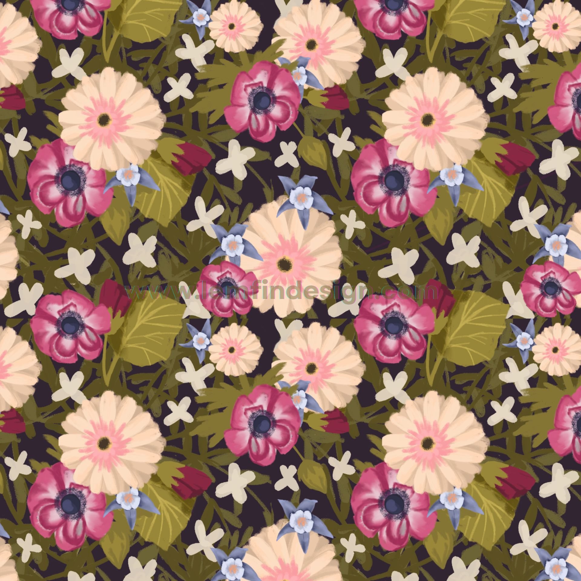
2. Mixing Different Looks
One of my early patterns combined loose hand-drawn doodles with polished vector icons. They clashed so badly it looked like two artists fighting on the same page.
Why it happens: You’re experimenting or reusing motifs from different sources.
Impact: The pattern feels disconnected, like the pieces don’t belong together.
Fix: Stick to one or two consistent styles. Cohesion makes the design stronger.
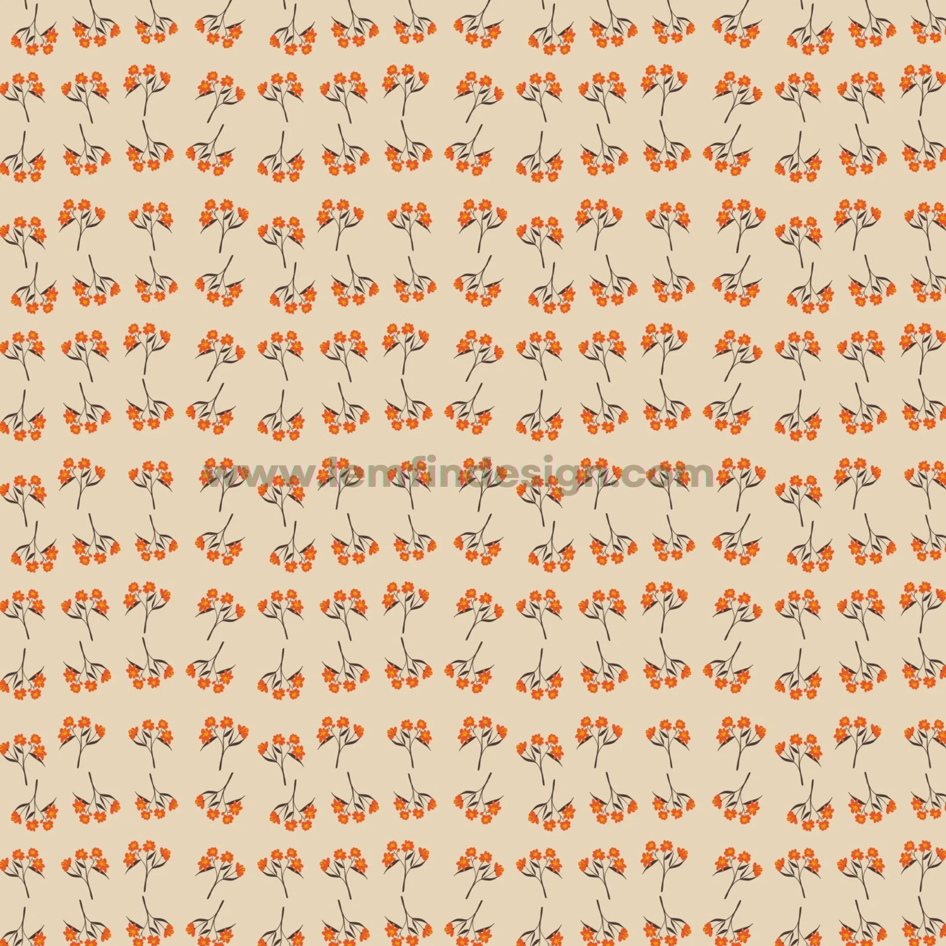
3. Unwanted Rows
I once made a scatter of flowers that looked fine up close. But when I zoomed out, they lined up into rows like striped wallpaper.
Why it happens: Our brains naturally space objects evenly, so rows form even when we don’t plan them.
Impact: The design feels stiff and mechanical instead of natural.
Fix: Always tile your repeat multiple times and look at it from a distance. Shuffle motifs slightly until the rows break apart.
4. Strange Empty Paths
The opposite of rows is when gaps between motifs create clear “roads.” I had a leafy design once that looked like it had highways running across it.
Why it happens: Motifs are spaced too evenly, leaving long negative spaces.
Impact: The eye follows the empty path instead of the motifs.
Fix: Break up the road with filler motifs or by moving elements around.
5. Big Gaps
Sometimes, no matter what I did, a big hole appeared in the middle of my design. It made the whole pattern feel incomplete.
Why it happens: Motifs aren’t evenly distributed, or there aren’t enough supporting motifs.
Impact: The design looks patchy, like something is missing.
Fix: Add smaller motifs to fill in the gaps, or redistribute existing ones more evenly.
6. Motifs Too Close
On the flip side, sometimes two motifs ended up so close they looked glued together. Once, two flowers overlapped in a way that distracted from everything else.
Why it happens: Placement errors go unnoticed until you see the repeat tiled.
Impact: Creates “clumps” that throw off the balance.
Fix: Give motifs breathing room. Step back, tile the design, and check for awkward clusters.
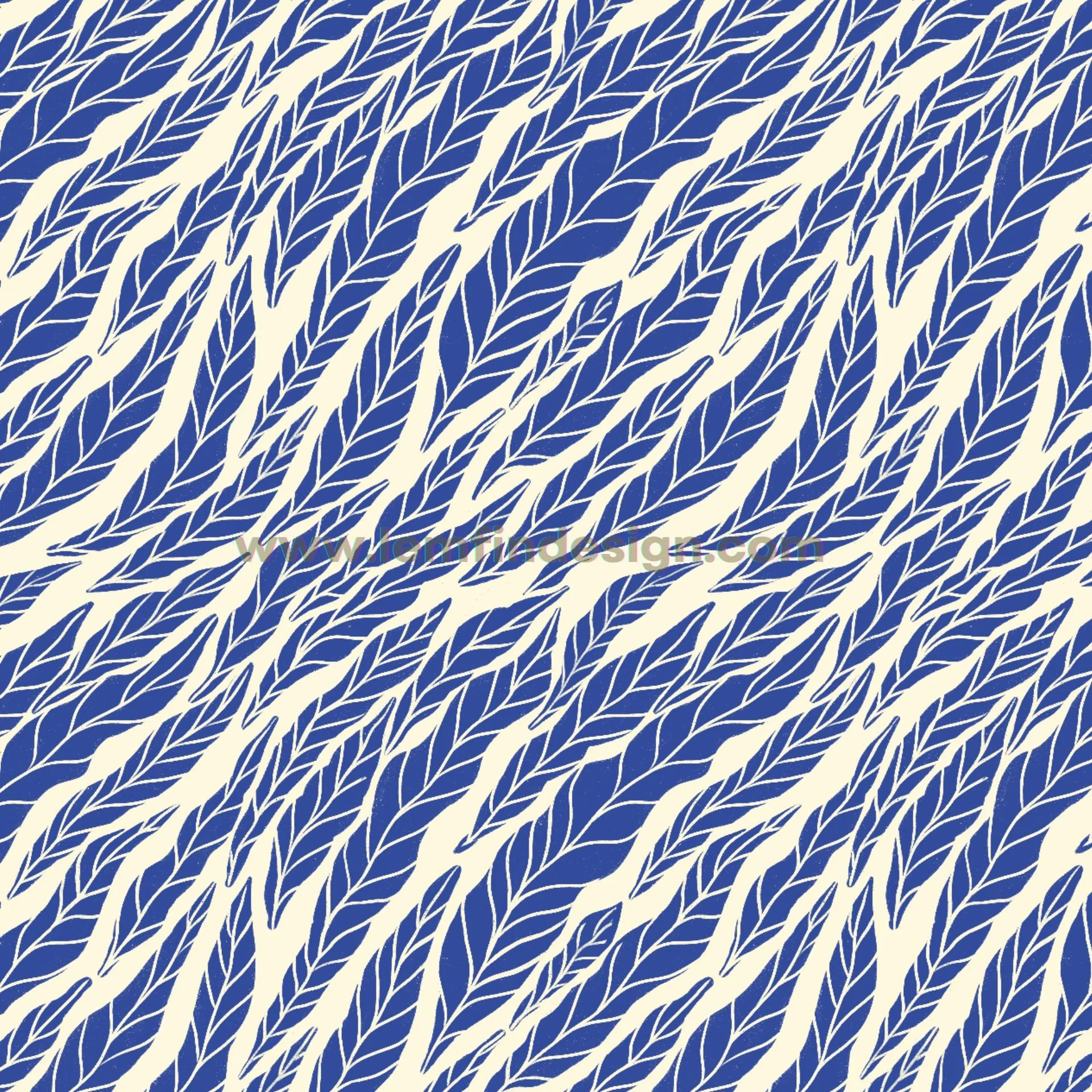
7. Everything Leaning One Way
I once made a scatter of leaves where every single leaf pointed to the right. When tiled, the whole design looked like it was tipping over.
Why it happens: All motifs share the same orientation.
Impact: The pattern feels unstable, like it’s sliding off the page.
Fix: Rotate or flip some motifs to add variety, or try a structured layout like half-drop.
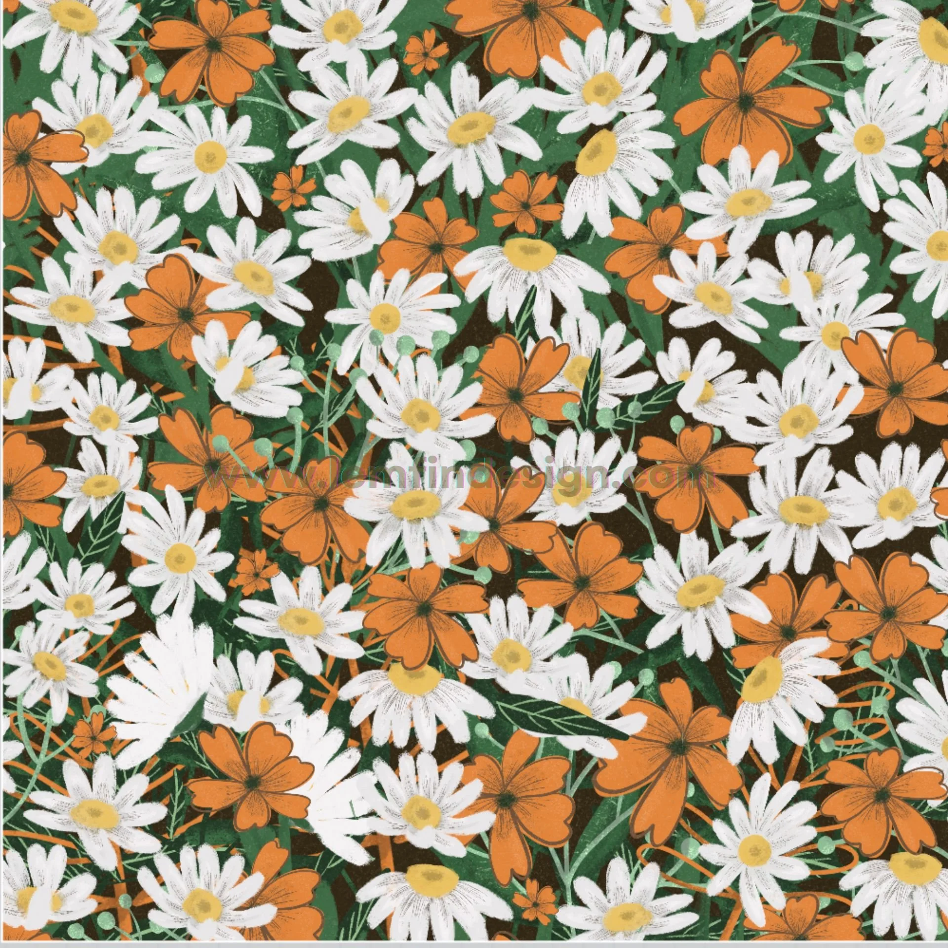
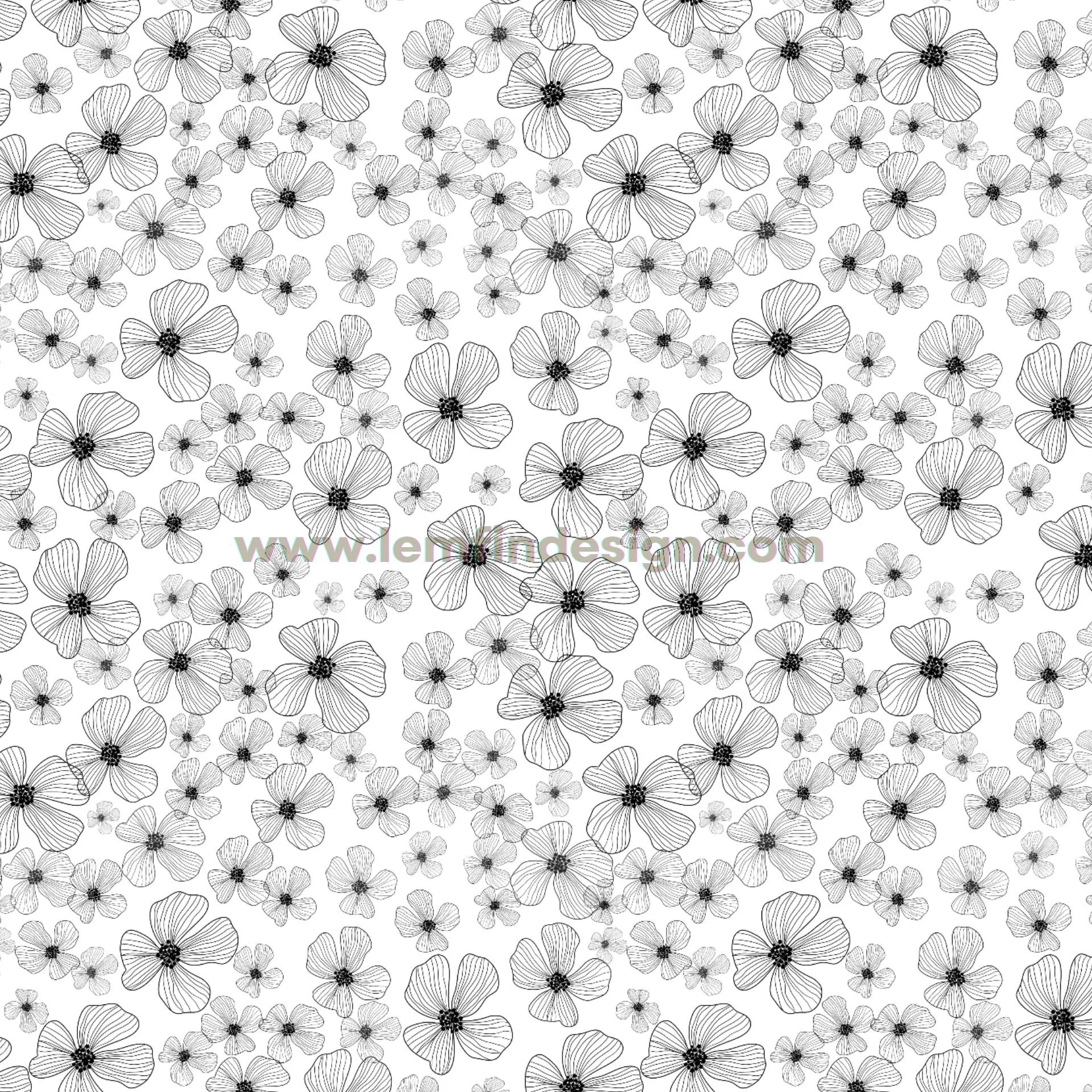
8. Too Many Colors
'I love colors, but in my first patterns, I used 8 or 9 shades. Instead of lively, it looked chaotic.
Why it happens: Color is exciting, and it’s tempting to use as many as possible.
Impact: Colors compete for attention; the eye doesn’t know where to focus.
Fix: Start small: one or two motif colors plus a background. Add slowly, and test versions before committing.
9. Details Hard to See
I once spent hours adding tiny textures to a flower, but on a background that was almost the same color. When I printed it, all the details disappeared.
Why it happens: Not enough contrast between motif and background.
Impact: Small details get lost or strain the eyes.
Fix: Ensure colors differ enough in brightness. Use outlines, shadows, or adjusted hues to make details visible.
10. Lines Out of Balance
When I resized vector motifs, I forgot to fix the stroke weight first. As a result, the outlines scaled with the shapes—some became super thick, while others turned paper-thin. The whole design looked uneven and messy.
Why it happens: In vector software like Illustrator, stroke weight changes automatically when you scale a shape unless you lock or expand it first.
Impact: The motifs look inconsistent, as if they don’t belong to the same design.
Fix: Before resizing, expand or fix your strokes so the weight stays consistent. Or, redraw motifs at the right size to keep lines balanced—or skip outlines altogether if they aren’t essential.
11. The Tile Is Too Obvious
Sometimes you can clearly see the repeat block. Once you notice the tile, the design feels mechanical, like tiled flooring.
Why it happens: The repeat edges are too obvious, or motifs are repeated too regularly.
Impact: The seamless illusion is broken.
Fix: Test at different scales. Add small variations near edges to blur the repeat.
12. Forgetting the Final Product
In the beginning, I designed only for the screen. But when I printed on fabric, the details were too small to see.
Why it happens: Designing without considering the end use.
Impact: The pattern doesn’t translate well to real-life products.
Fix: Always imagine where the pattern will live—fabric, wallpaper, stationery—and adjust scale and detail for that purpose.
Final Thoughts
Every one of these mistakes frustrated me when I started. But they also trained my eyes to notice balance, flow, and rhythm.
✨ When my patterns felt “off,” I used to get frustrated. But looking back, I realize those mistakes were just part of learning. The more I practiced, the more I trained my eyes to notice balance, and slowly I started making fewer of the same errors.
